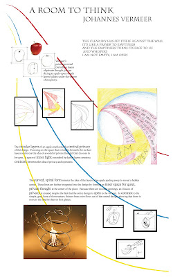
 This is a process poster for a 3-D room project. This project was based on an interpretation of the work of Johannes Vermeer, with an apple as the inspiration object. Through making this poster, I learned the importance of planning before I started creating. This is something I struggle with, I prefer to work with moving around the actual project. However, with this project I sat down and took the time to completely plan out the poster beforehand. Although I had to somewhat alter my original plan, this was very helpful and I think it benefited the overall organization of my design.
Wednesday, April 28, 2010
 This is a process poster for a 3-D room project. This project was based on an interpretation of the work of Johannes Vermeer, with an apple as the inspiration object. Through making this poster, I learned the importance of planning before I started creating. This is something I struggle with, I prefer to work with moving around the actual project. However, with this project I sat down and took the time to completely plan out the poster beforehand. Although I had to somewhat alter my original plan, this was very helpful and I think it benefited the overall organization of my design.
Wednesday, April 14, 2010

I drew this on photoshop using a Wacom tablet. I originally imported a picture of Mickey Mouse from the internet and then traced over it on a new layer using a Wacom tablet and a pen. Then, on a new layer, I colored in my newly traced drawing, also using the Wacom tablet and pen. I thorougly enjoyed learning to use this device, and, as you can see, it gives you the ability to be quite exact. Being able to trace a drawing like this greatly improved my dexterity with the tablet.
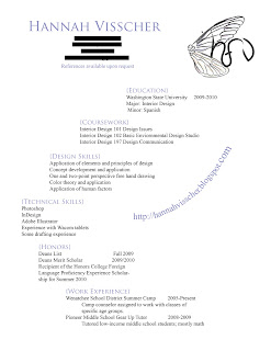
 This is the resume I created on InDesign. While formatting it, I tried to mimick the shape of the wings in my logo, and used the soft purple of the wings for my title blocks. This task, to come up with a graphic design for my resume, was challenging for me. I had trouble forcing myself to think outside of the box, having created so many simple resumes in the past. However, I am very happy with what I came up with. I think it shows my creativity while still being balanced and easily readable.
Wednesday, April 7, 2010

This is the logo I created. When I was brainstorming, many of the words I was thinking of were simple, whimsical, nature, soft colors, and curves. I really struggled during my brainstorming process to think of how I could interpret this on the computer. I especially struggled with fonts. While developing my ideas, I had drawn lettering that i liked, but was having trouble finding a font that matched it, or could be manipulated to match it. I also was having difficulty finding an image that I was happy with. I loved the idea of a dragonfly wing, I think the paned quality of the wings are beautiful. However, I wasn't sure how I could manipulate the picture to get the effect I wanted.
That is when I decided to use the Wacom tablet, and I am very happy that I did. I ended up using the tablet to draw my own font, and then I traced over a picture of a dragonfly wing using the charcoal paintbrush effect. I also decided to add some soft colors to the wing because one of the things I love about the wings are their luminescent quality. I am very happy with the result. I think that it is delicate and whimsical, like I wanted, and the curves create nice movement. I also got to practice and improve my drawing skills on the Wacom tablet!
That is when I decided to use the Wacom tablet, and I am very happy that I did. I ended up using the tablet to draw my own font, and then I traced over a picture of a dragonfly wing using the charcoal paintbrush effect. I also decided to add some soft colors to the wing because one of the things I love about the wings are their luminescent quality. I am very happy with the result. I think that it is delicate and whimsical, like I wanted, and the curves create nice movement. I also got to practice and improve my drawing skills on the Wacom tablet!
Subscribe to:
Comments (Atom)
