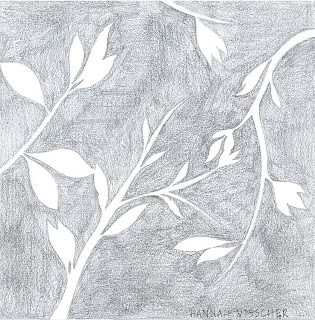
 This is my favorite of all the sketches I have done. The goal of this one was to reverse the normal shading, essentially outlining the object in shadow instead of lines. I began this by doing a light sketch of the branches and leaves. Then I used a soft drawing pencil to color in the space around the form, erasing as I went. I love what I ended up with. The only odd part that I would probably change is the branch coming down from the top. It seems a little out of place, it might be better coming in from the other direction or possibly have more than just one bloom on it.
Wednesday, March 24, 2010
 This is my favorite of all the sketches I have done. The goal of this one was to reverse the normal shading, essentially outlining the object in shadow instead of lines. I began this by doing a light sketch of the branches and leaves. Then I used a soft drawing pencil to color in the space around the form, erasing as I went. I love what I ended up with. The only odd part that I would probably change is the branch coming down from the top. It seems a little out of place, it might be better coming in from the other direction or possibly have more than just one bloom on it.
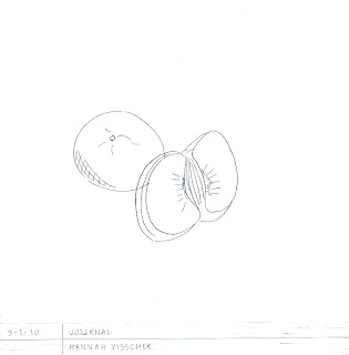 This is a sketch I did of a satsuma orange. There are obviously some flaws in the sketch, but I really like how simple it was. I used very simple lines and tried not to go into to much detail, which I think ended up looking very good. If I were to do it again I would try to make the lines a little cleaner and draw the overlaps better. Overall, though, I like how it ended up.
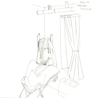
This is a sketch of the corner of my dorm room. I did this before we I did any perspective workshops, so everything is a little off kilter. However, I chose to post it because I really like the detail and some of the texture. Behind the chair is a bunk bed ladder that I have hung all of my scarfs on. I really enjoyed drawing this and attempting to show the different textures of the fabrics hanging up on the ladder. Although this is definitely not correct perspective, I think it shows a good start on understanding perspective and I really like the lines and details.
Photoshop Textile Pattern
 The Netherlands are known for many things, such as wooden shoes, windmills, and tulips and the famous Red District. However, one of the most resounding images is the deep green of the wet, low-lying countryside juxtaposed against the blue of the rivers and canals. The people of the Netherlands are also known for their craftsmanship in lace and Delft pottery. Dutch lace is known for its distinct cauliflower pattern and the strength of the cloth itself while Delft pottery and tiles stand out with their contrasting blue and white design, reminiscent of the sea on which many of the Dutch depend. Many Dutch immigrated to America to escape religious persecution and practice in the Dutch Reformed Church. The Calvinistic traditions are carried on in many Dutch-American households today.
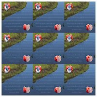
The background of this image is reminiscent of the landscape of the Netherlands, of deep blue strands of water weaving through green pastures and towns. Embedded in the river is a traditional Dutch dinner prayer, remembering the reason so many Dutch people traveled to America. The tulips, three their natural color while two are the color of Delft tiles and the lace that was so prevalent in Dutch homes and crafts, represent the strong merchant traditions present in the Netherlands.
I love my original 10 in x 10 in square; however, I think that when put together, the overall pattern lacks continuity. If I had been able to connect the blocks somehow, I think that the overall design would have had more impact. The pattern has a deeply significant meaning for me, though. Everything I added was important to my heritage and personal to me in that it helped me learn more about my family and where I come from. The research and the resulting creativity that went into this textile pattern became a learning experience, not just about design but also about a heritage that is extremely important to me and my family.
Photoshop Quilt Pattern
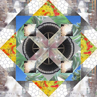
When selecting photos for this pattern I tried to find some neutrals and some colors, so that I would have contrast in my pattern. All of these pictures were taken by me on a digital camera. The two most colorful were of a bed of flowers and the sky, I also chose a photograph of grass. The rest of the photos were either already in neutral tones, or I used photoshop to dim the colors.
Although I originally liked the more colorful pictures the best, my favorite image ended up being one I took of the Experience Music Project in Seattle. Using photoshop I contorted the image and made it virtually unrecognizable. Then I added a stained glass texture and ended up with an image of contrasting lights and darks that is fascinating.
Overall, I really like this pattern. The only problems I have with it are, first, in craftsmanship and, second, in the way I chose to lay out the colors. The most obvious problem is the craftsmanship. There are some gaps in between images that are very obvious when examined. Also, looking at it again, I'm not sure that I like the fact that the entire border is in neutrals. When i originally made this pattern I wanted the bright colors to be a focal point; however, if I went back and did it again I might look at adjusting the layout.
Above all, creating this pattern drastically improved my photoshop skills. It also began to improve my ability to think abstractly. It forced me not to look at the photographs for what they were, but to think about how I could make them unidentifiable yet still beautiful.
Subscribe to:
Comments (Atom)
