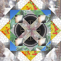
When selecting photos for this pattern I tried to find some neutrals and some colors, so that I would have contrast in my pattern. All of these pictures were taken by me on a digital camera. The two most colorful were of a bed of flowers and the sky, I also chose a photograph of grass. The rest of the photos were either already in neutral tones, or I used photoshop to dim the colors.
Although I originally liked the more colorful pictures the best, my favorite image ended up being one I took of the Experience Music Project in Seattle. Using photoshop I contorted the image and made it virtually unrecognizable. Then I added a stained glass texture and ended up with an image of contrasting lights and darks that is fascinating.
Overall, I really like this pattern. The only problems I have with it are, first, in craftsmanship and, second, in the way I chose to lay out the colors. The most obvious problem is the craftsmanship. There are some gaps in between images that are very obvious when examined. Also, looking at it again, I'm not sure that I like the fact that the entire border is in neutrals. When i originally made this pattern I wanted the bright colors to be a focal point; however, if I went back and did it again I might look at adjusting the layout.
Above all, creating this pattern drastically improved my photoshop skills. It also began to improve my ability to think abstractly. It forced me not to look at the photographs for what they were, but to think about how I could make them unidentifiable yet still beautiful.

No comments:
Post a Comment